
Botanical Luxury: Blue Holiday Botanicals
(Monthly Inspiration Series)
Creativity is a gift… but let’s be honest, it doesn’t always come with an “on” switch.
Some days it’s a full-body YES. Ideas flying, colors clicking, your brain basically doing jazz hands.
Other days? You’re staring at your screen like it personally betrayed you.
It took me a long time to accept that this is normal. And then it took me even longer to realize it’s normal for a lot of us.
So instead of waiting for inspiration to magically show up with coffee and a pep talk, I’m giving it a place to land.
Welcome to my new Monthly Inspiration Series. 🎨✨
Each month I’ll curate a little creative spark-starter: a mix of images, textures, color cues, and style notes designed to get your ideas moving again — gently, without pressure.
This month’s theme: Botanical Luxury
Think: elegant florals, soft winter greenery, rich color contrast, and that quiet “I have my life together” vibe… even if your studio says otherwise.
And for our first drop?
A calm, cool, wintery beauty called:
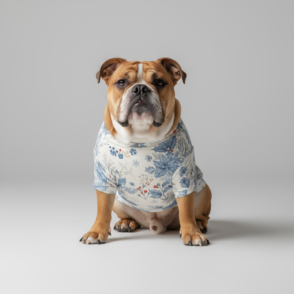
Blue Holiday Botanicals
A botanical print that feels like a fresh breath of air and a fancy hotel lobby at the same time.
It’s clean. It’s layered. It’s soothing, but still has presence.
Picture icy blues + soft neutrals, delicate linework, and holiday botanicals that don’t scream “December 24th only.”
This one lives way past the season.
What “Botanical Luxury” looks like right now
Here’s what I’m seeing (and loving) in this vibe:
Botanicals with restraint
Not chaotic garden explosions. More curated stems and airy spacing.Winter-cool color stories
Blues, smoky gray, soft cream, quiet red accents. Crisp but cozy.Fine detail + soft contrast
Elegant enough for adults, whimsical enough for kids’ spaces depending how you style it.Nature, but polished
Think: greenhouse meets boutique hotel meets “I light a candle even when no one’s coming over.”
Color & texture notes
If you want to build around this print, here’s your cheat sheet:
Primary palette:
Frosty blue
Deep inky navy
Snowy white
Soft gray
Accent pops:
Muted berry red
Winter evergreen
Warm oat-neutral
Texture pairings that work:
Linen, cotton percale, brushed twill
Matte ceramics
Clear glass + silver metal
Anything with subtle ribbed or woven structure
Basically: keep it soft, keep it clean, let the print do the talking.
Where this print shines
You can use Blue Holiday Botanicals a million ways, but here are a few favorites:
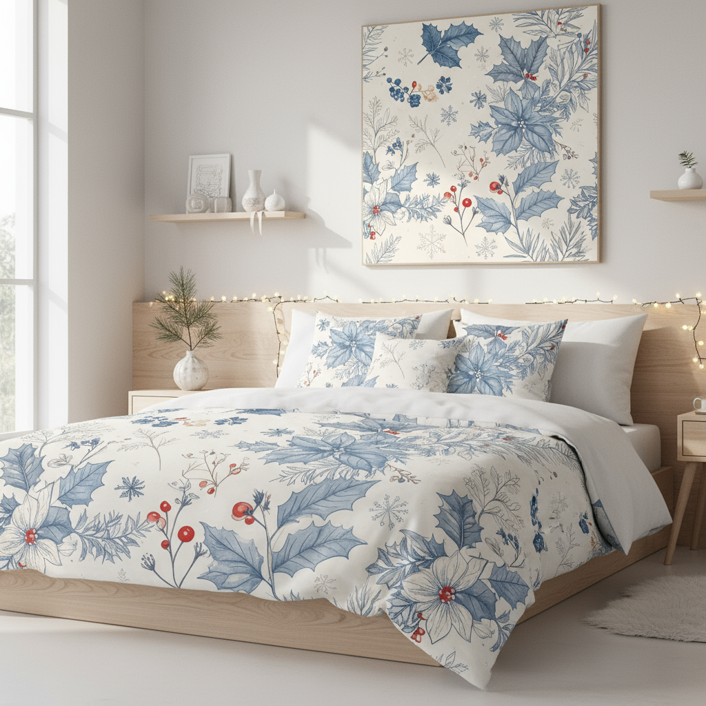
Home moments
Framed wall art in an entryway or bedroom
Winter refresh gallery wall
Cozy luxe coffee-nook print
Guest room “quiet wow” detail
Creative projects
Moodboards for clients
Pattern pairing reference
Color direction for new collections
Background for Pinterest pins or IG posts
Giftable stuff
Print and wrap as a last-minute classy gift
Holiday cards or tags
Planner dashboards
Digital vision boards
It’s one of those designs that just behaves nicely in a lot of spaces.
Grab the download
If this vibe is calling your name, you can download Blue Holiday Botanicals right here:
👉 Blue Holiday Botanicals – Digital Download Print
(Insert your product link)
Print it. Style it. Save it for later. Use it as your “okay I’m back” creative reset.
And if you want to share how you used it?
Send me a pic or tag me. I love seeing what you make.
Next month…
New theme. New palette. New creative sparks.
If you want that little monthly jolt of inspiration in your inbox, make sure you’re on the list.
Until then — be kind to your creativity.
It’ll show up when it’s ready.
And when it does? We’ll be here with something pretty to start from.
xo,
Katherine
PS-(you can also buy products @Spoonflower)


Look at all the cool things you can do with this print!
Home + décor glow-ups
Frame it for an instant winter-luxe wall moment (bedroom, entryway, hallway, office).
Pop it on a shelf or mantle as seasonal art that doesn’t scream holiday overload.
Make a mini gallery wall with other blue/neutral botanicals.
Use it in a guest room to give that “boutique hotel but cozy” vibe.
Print small and tuck it into a kitchen nook or coffee bar setup.
Easy gifts (that look way fancier than they cost)
Print + frame = instant hostess gift.
Pair it with a candle or tea for a calm winter care package.
Print on cardstock and turn it into elegant holiday cards.
Use cropped sections for gift tags or little enclosure notes.
Make a “new home” or “new year refresh” gift set.
Creative / design uses
Drop it into moodboards for clients who want soft botanical luxury.
Use it as a color-story anchor for a collection or room concept.
Reference it for pattern pairing ideas (stripes, mini ditsy florals, soft geometrics).
Pull the palette for fabrics, bedding, stationery, or packaging direction.
Add it as a background layer in Pinterest pins or IG carousels.
Print-it-your-way options
Go big for statement art.
Go small for a sweet, subtle accent.
Print on matte paper for soft elegance.
Try lightly textured or linen paper for that extra “ooh.”
Do a black frame for contrast or a white frame for airy calm.
Seasonal styling that lasts past December
Winter refresh without the “only here for two weeks” energy.
Works for holiday décor, but also January calm-reset season.
That blue botanical vibe carries beautifully into early spring too.